Campaign for Good
Typography III, Fall 2026
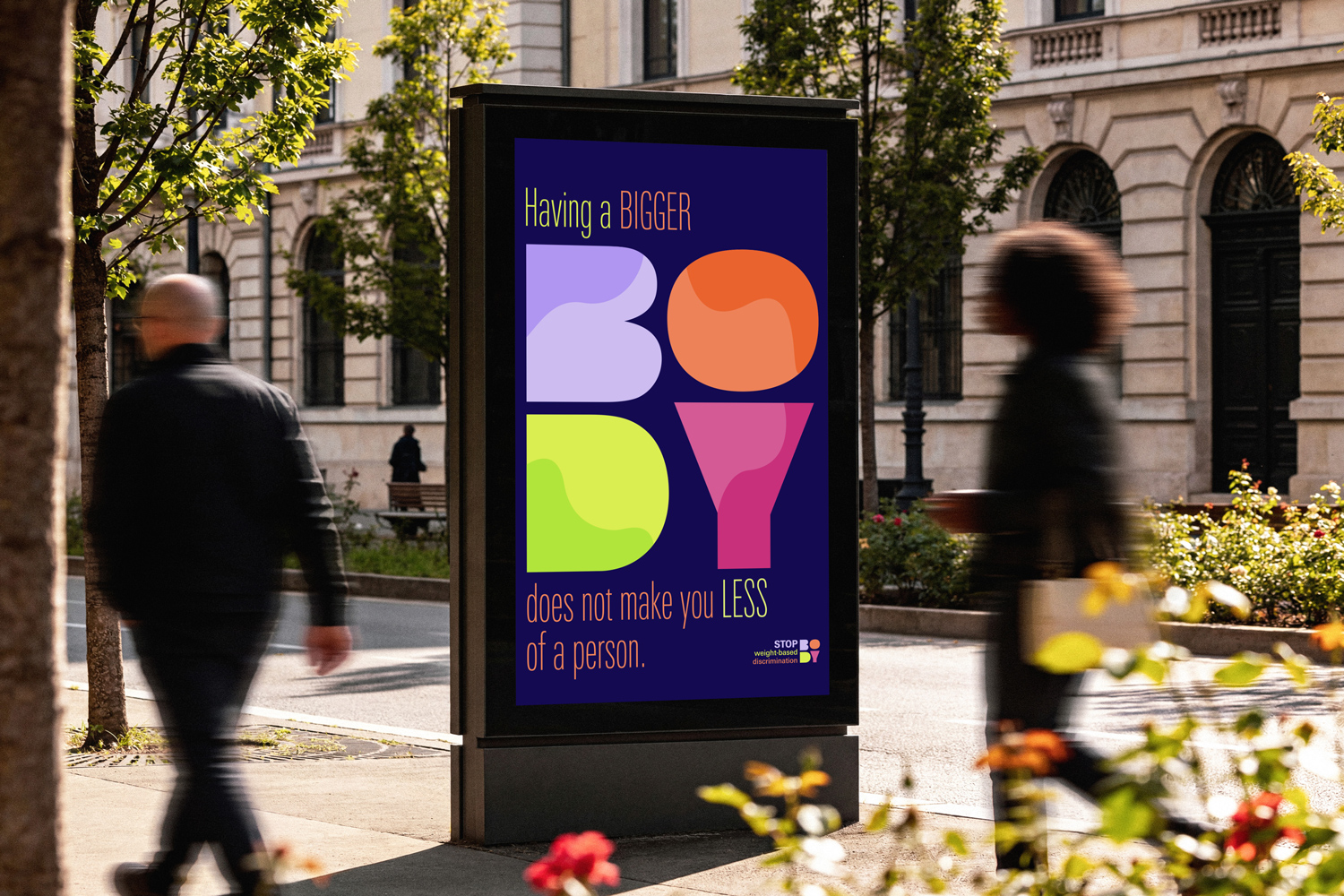
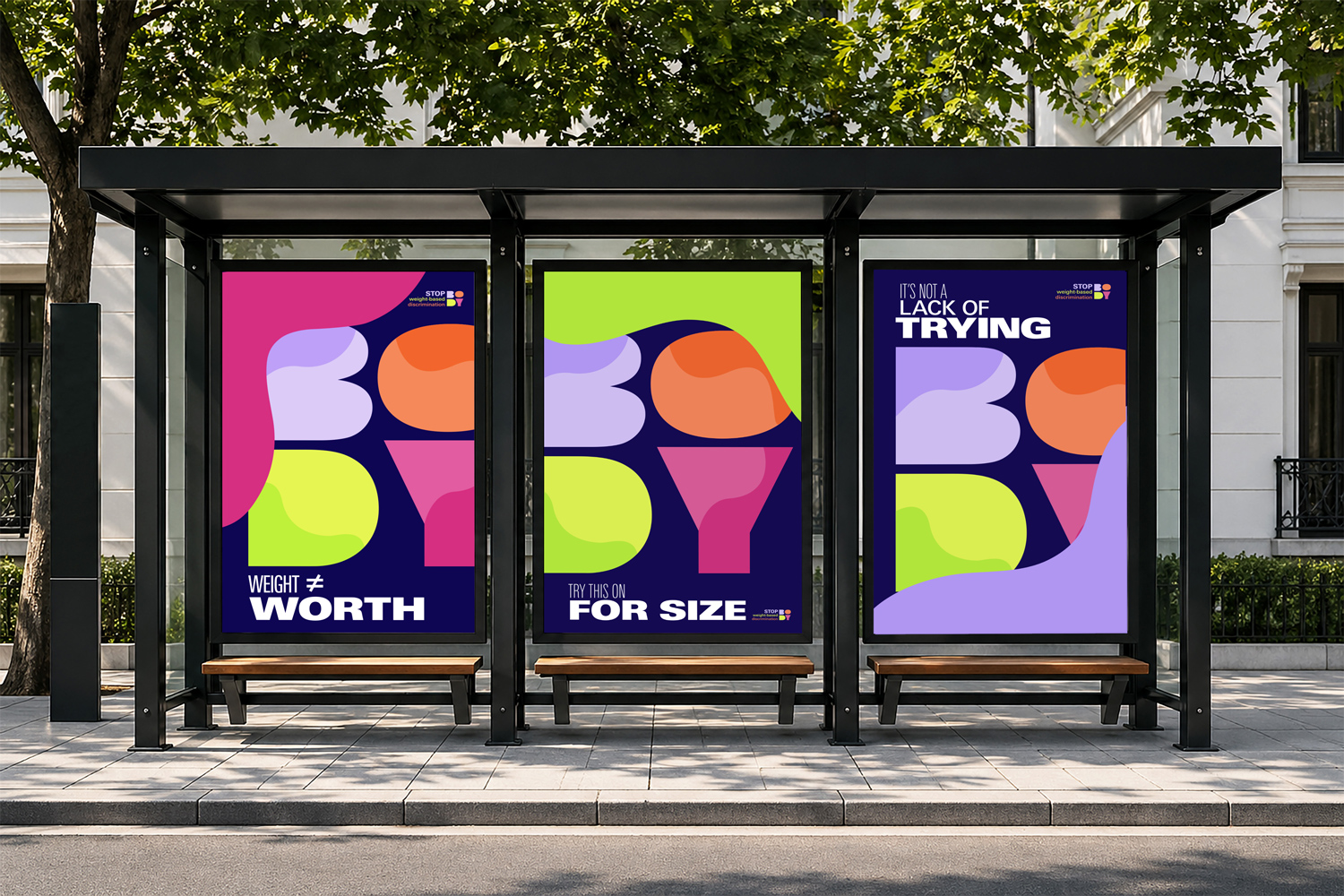
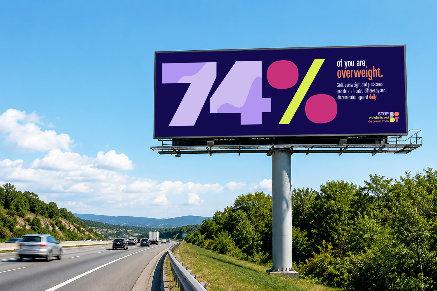
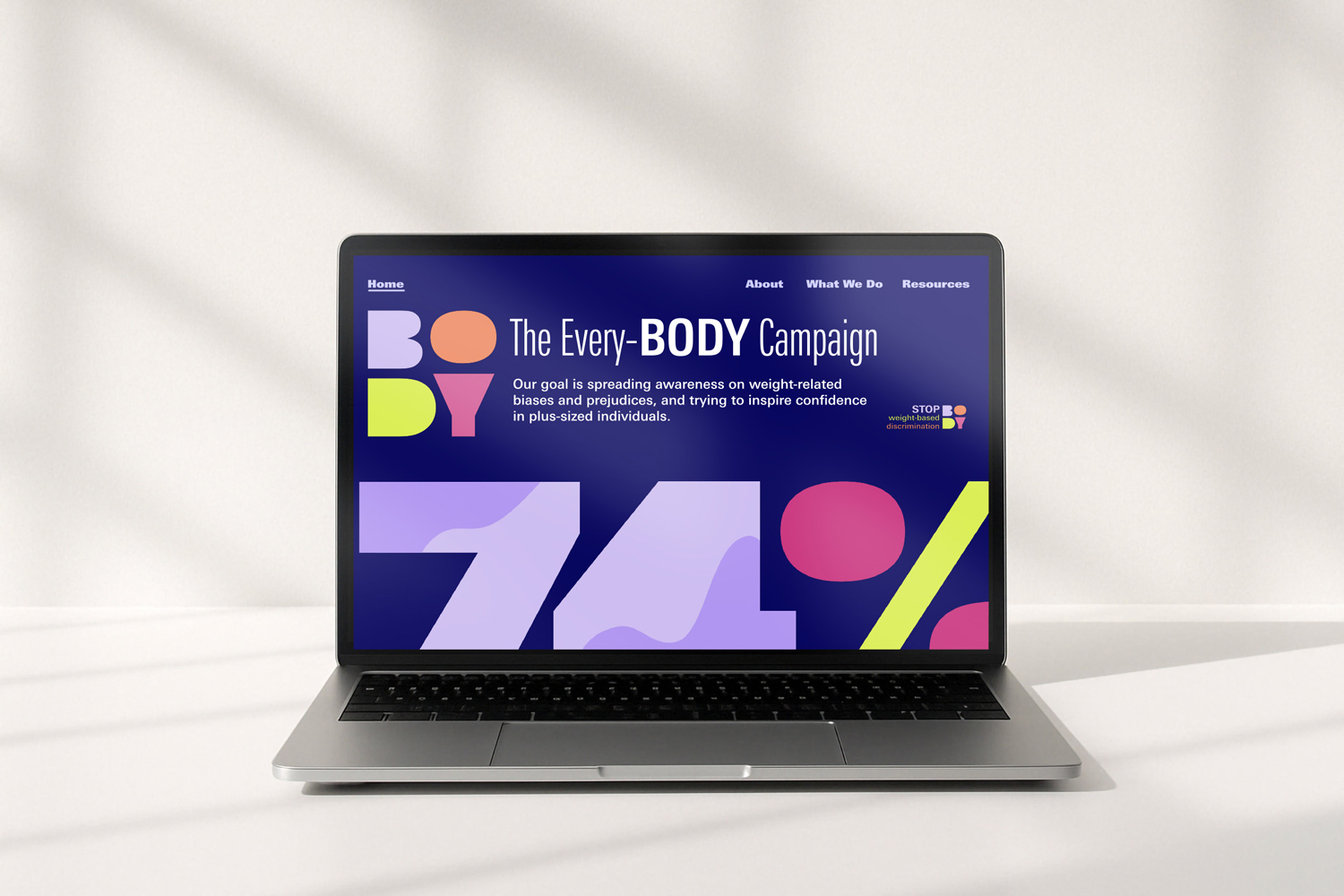
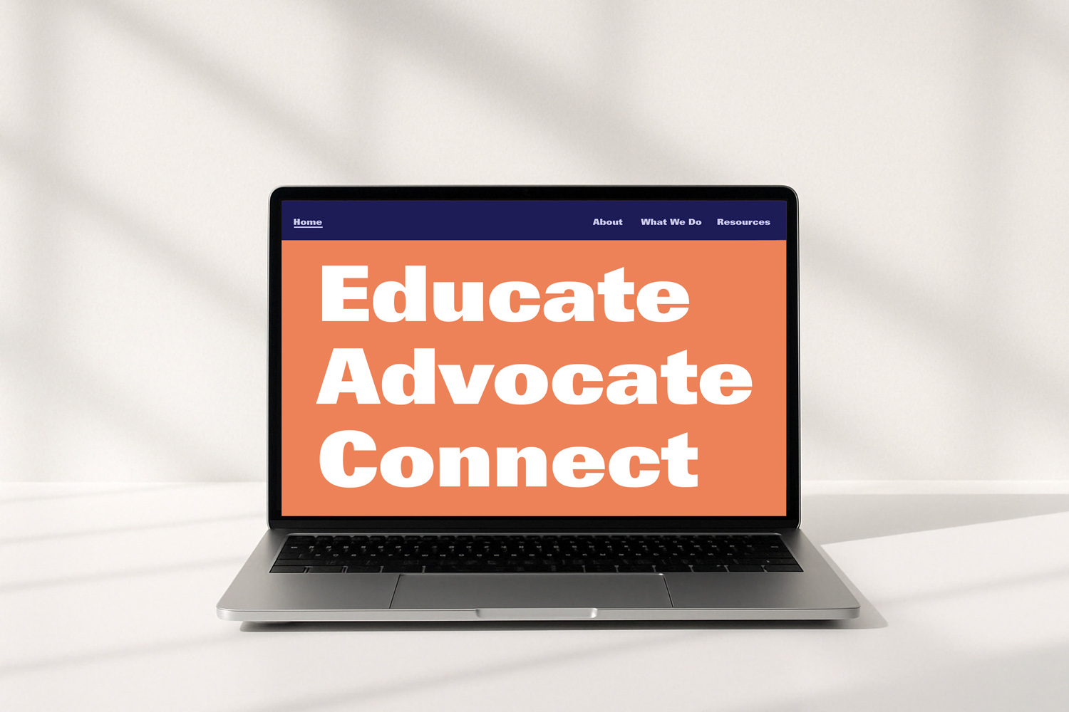
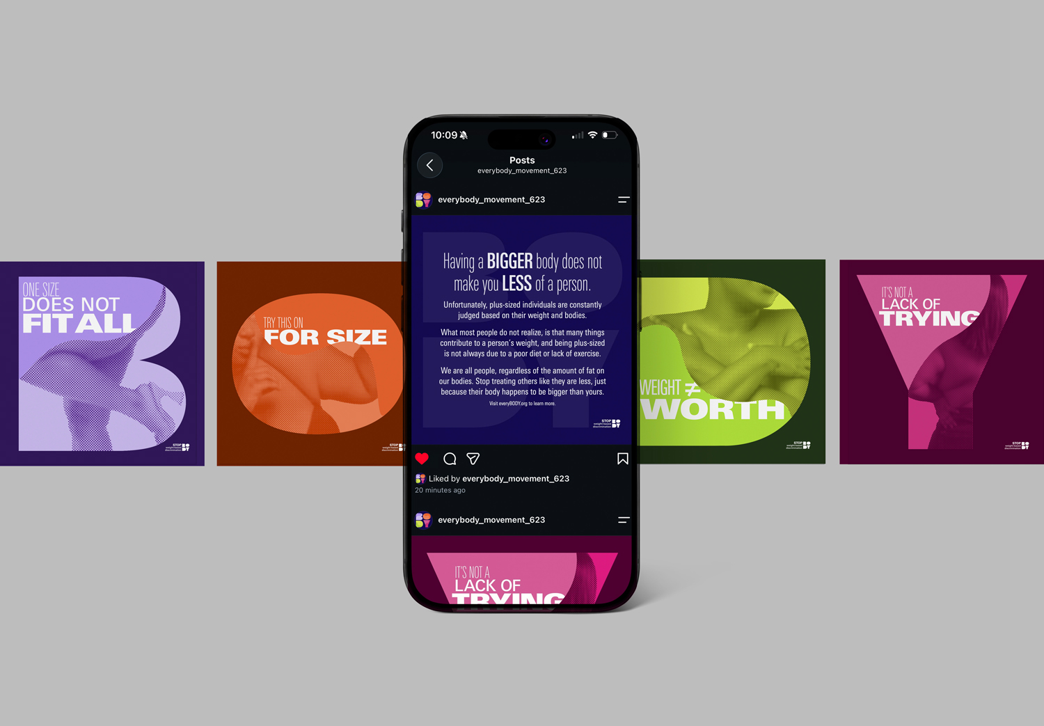
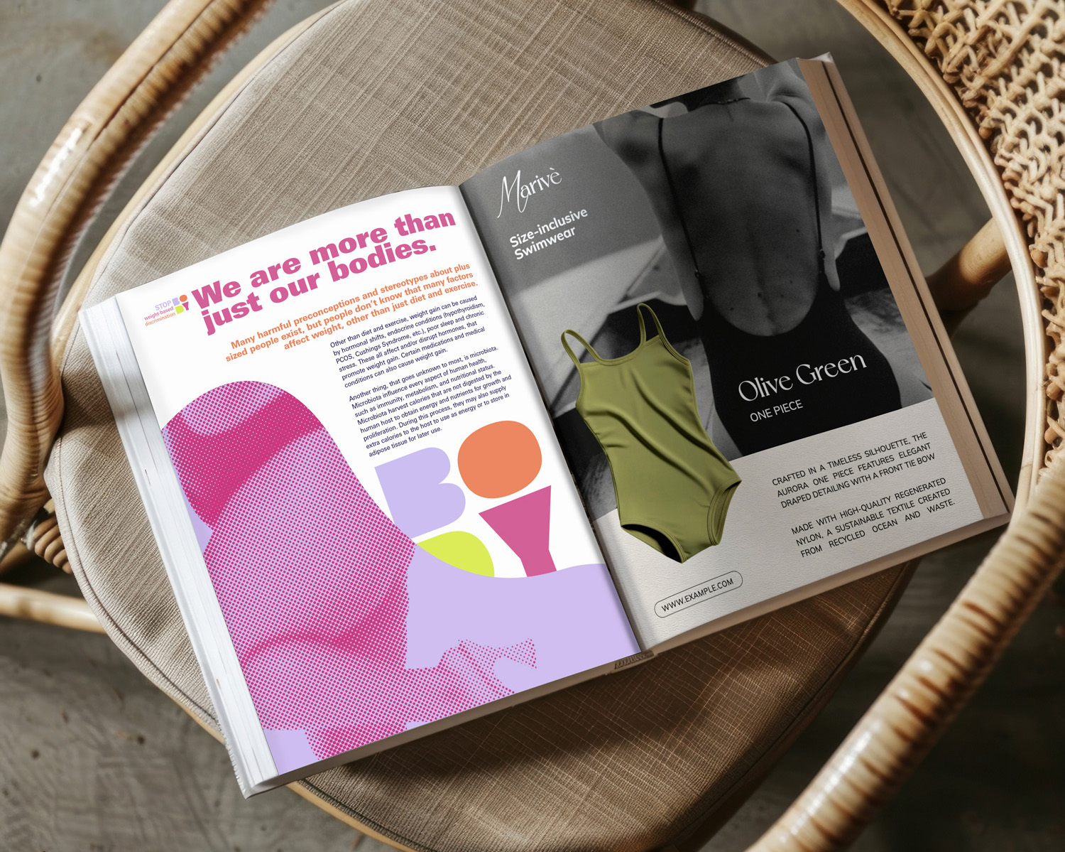
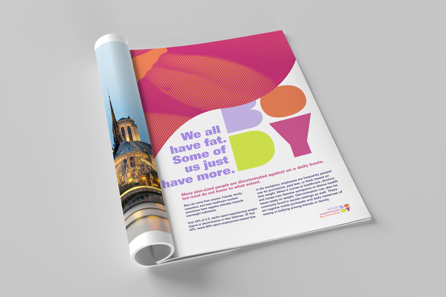
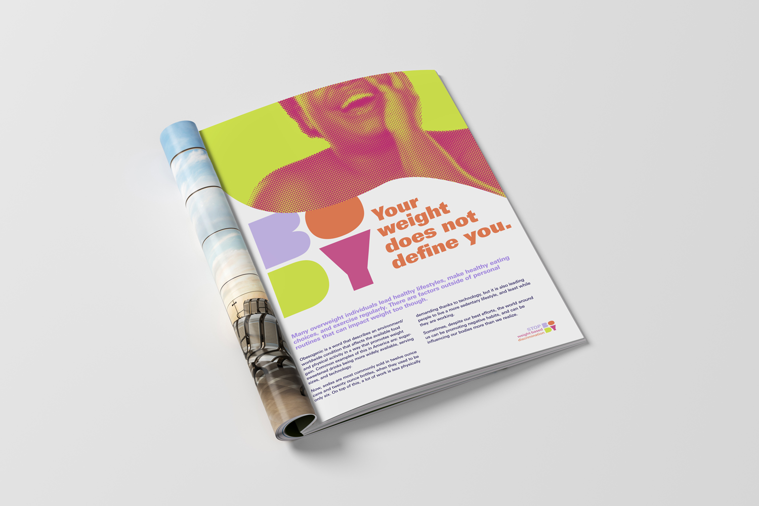
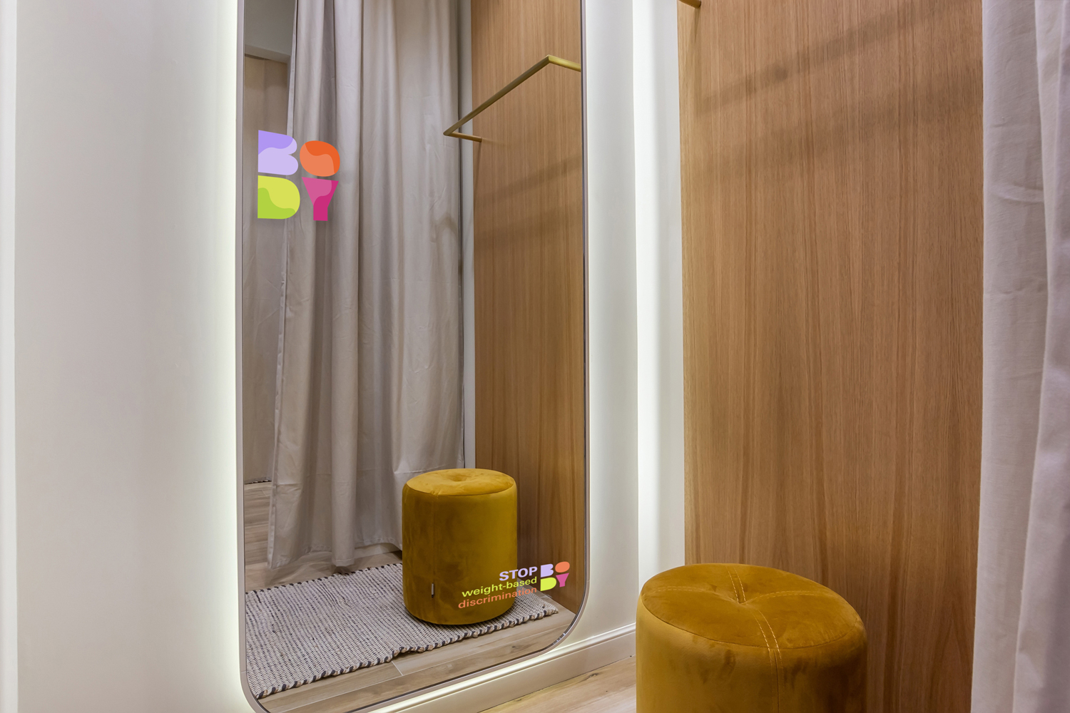
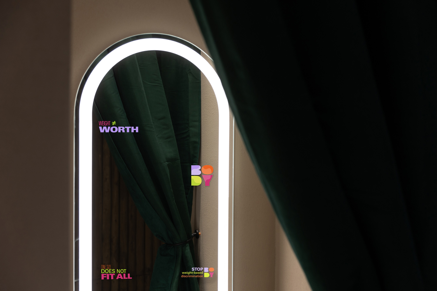
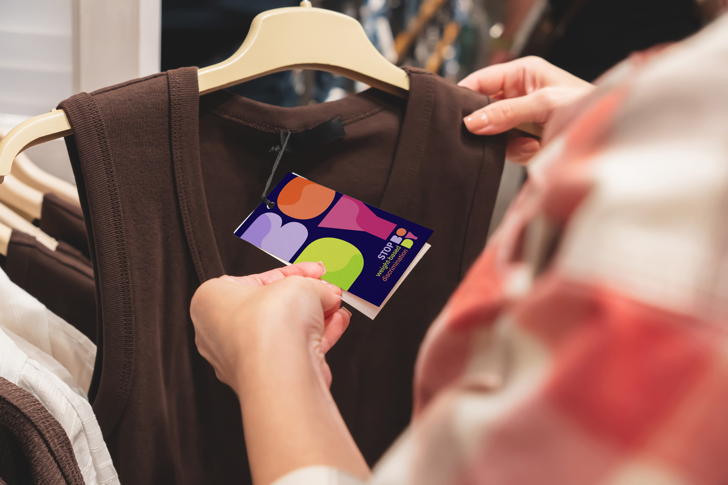
This is my most recent typography project, and my favorite one so far. We started by choosing a social issue, and creating a campaign that we would design a poster, print ads, social media ads, website, transportation ad, and an item of our choice for. I decided to choose a body positivty campaign, but I wanted it to be more than that. I wanted it to call out how people treat plus-sized people differently, and inform others about weight and being plus-sized. I also knew I wanted to challenge how body positivity is typically portrayed in media and similar campaigns. Most weight-based media uses muted, natural colors and elegant serif fonts, so I used bold sans serif type with very bright colors. I was very happy with how this project turned out, and I loved being able to create not only the campaign, but the branding for the entire campaign as well.